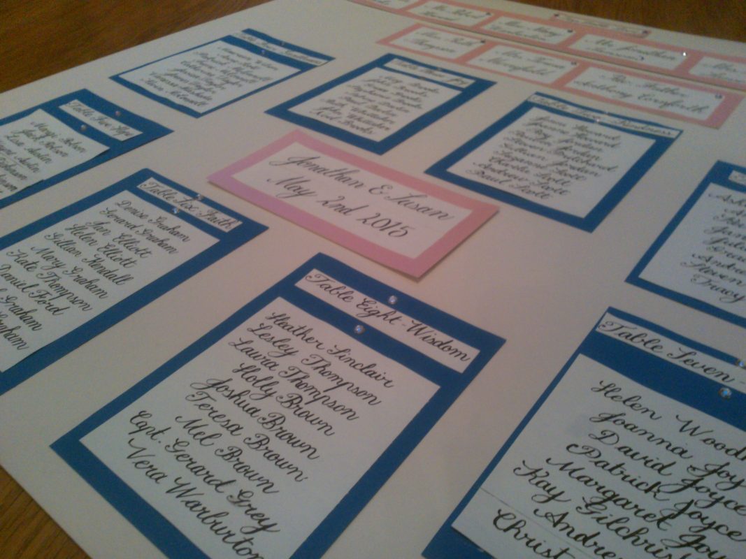
Calligraphy Styles
IT’S back to basics in calligraphy class this term, with the focus on foundational hand – aptly named, as it’s usually the first style of calligraphy people learn.
It provides an excellent basis for learning calligraphy, being based on the circle and verticle straight line, with each letter made up of individual pen strokes.
Over the years, my foundational and italic hands have merged slightly, so starting over again is a good opportunity to get out of some bad habits!
This made me think of the various calligraphy styles I’ve manged to get to grips with over the years.
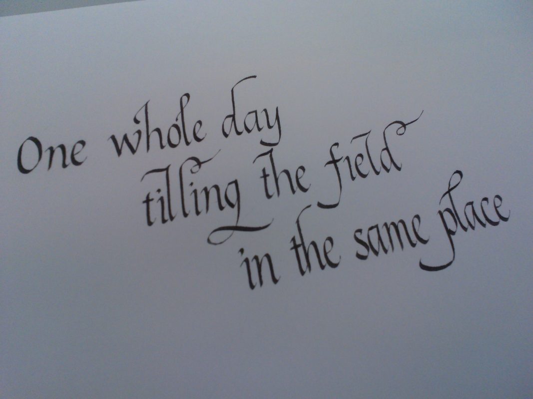 Italic
The italic hand was developed during the Renaissance in Italy in the 15th and 16th centuries, hence its name, and was used for Papal documents. It is more flourised than the Roman and Caroligian hands – with some calligraphers, like Gaynor Goffe, adding more of a flourish than others.
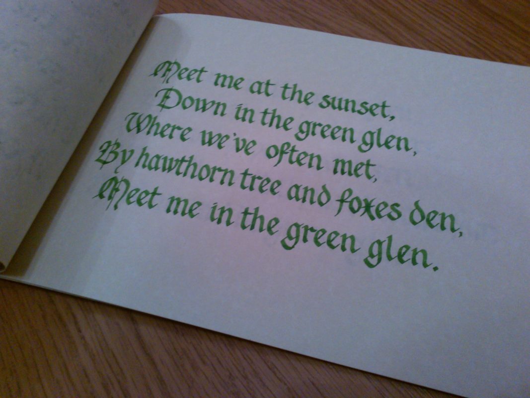 Gothicised Italic
There are many variations of Gothic lettering in manuscripts, characterised by dense, vertical strokes and a variety of built-up serifs. Gothicised Italic is more contemporary, but all gothic styles share the same basic elements of straight, vertical, consistent strokes.
 Roman small letter
The Roman alphabet is the most widely used in the world. Roman capitals, used in ancient Rome for carved stone inscriptions, provide the basis for the modern day calligrapher’s Roman capitals. Roman small letter is the miniscule, or lower-case form.
Uncial
Uncial script is written entirely in capital letters and was commonly used from the 4th to 8th centuries by Latin and Greek scribes. Modern uncial has borrowed heavily from some of the conventions found in more cursive scripts, such as flourishes and variable width strokes.
 Copperplate
Copperplate, or English round hand, is created using a sharp pointed nib instead of the flat nib used in most calligraphic writing. It was prevalent in the 19th century, but was used as early as the 16th century in Europe. The thickness of the stroke is determined by the pressure applied when writing and all forms are written at a letter slant of 55 degrees.
 Akim
Akim
I kept slipping into shorthand when I learned this script, by German calligrapher Hans-Joachim Burgert. There are no special tools needed, as the script is monoline, with no thick or thin lines, so fineliners are perfect! Akim is a rhythmic, linear script, based on swinging arches.