
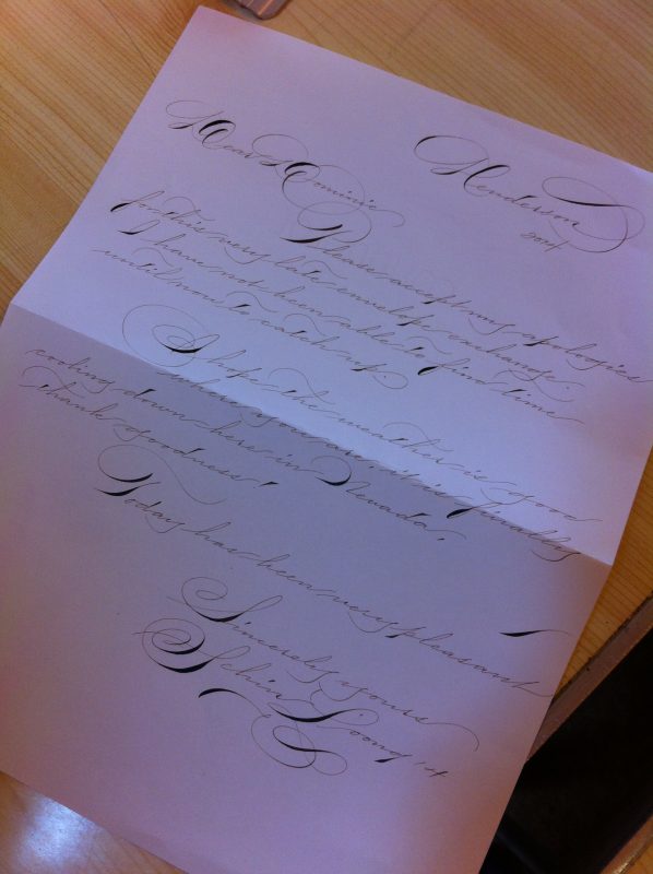
Copperplate calligraphy
There’s something really romantic about Copperplate script.
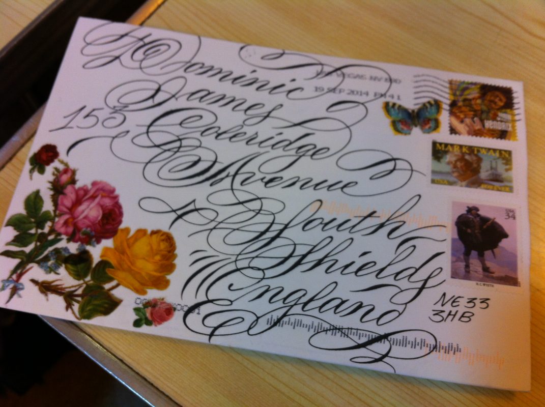 It’s such a swirly, twirly, beautiful style of calligraphy – and so different from the rest.
It is written using a sharp, pointed nib, instead of the flat nib used in most calligraphic writing.
It also differs from that produced by angled nibs in that the thickness of the stroke is determined by the pressure applied when writing, rather than nib angle in relation to the writing surface.
The pen is also held at a rather steep angle – minuscules, majuscules, numbers and punctuation are all written at a letter slant of 55 degrees from the horizontal.
This makes drawing guide lines rather tricky!
 Copperplate script was prevalent in the 19th century, but was used as early as the 16th century in Europe. Its name comes from the fact the copybooks from which students learned it were printed from etched copper plates.
It’s similar to the American Spencerian script, which was developed in 1840 by Platt Rogers Spencer as a style that could be written quickly and legibly for business correspondence, as well as personal letter-writing.
It was widely used until the typewriter came along in the 1920s. Both Ford and Coca-Cola adopted it for their logos and it was widely taught in schools.
 Now I’m a student of the copperplate script and although I’ve only been let loose on practising the pressure side of things with a pencil so far, I know I’m going to love writing it.
There’s so much history behind it – copperplate is the style in which the body of the United States Declaration of Independence is printed and look in any museum and you will find examples of it (believe me, I have).
As a result, it has a timeless elegance and I can’t wait to start creating some copperplate pieces for Creative Calligraphy clients in the near future.
To view my Pinterest board about copperplate script, click here.